

Walk through almost any old European city and you begin to notice something rather strange.
The beautiful buildings can look completely different from one another. A Gothic church has very little in common with a Georgian townhouse while an Italian palazzo might use an entirely different architectural language; somehow all three can still feel ordered and beautiful.
So what do they have in common?
For centuries architects worked with a collection of principles that helped turn a wall into something more than a wall. Proportion determined its shape while rhythm organized its openings; ornament then gave the building character without destroying the order underneath.
You can reduce much of this to seven basic ideas.
Think of them as the seven pillars of beautiful architecture.
Let’s start with proportion.
1. Proportion
More than two thousand years ago the Roman architect Vitruvius argued that buildings should possess relationships between their parts much like the human body does.
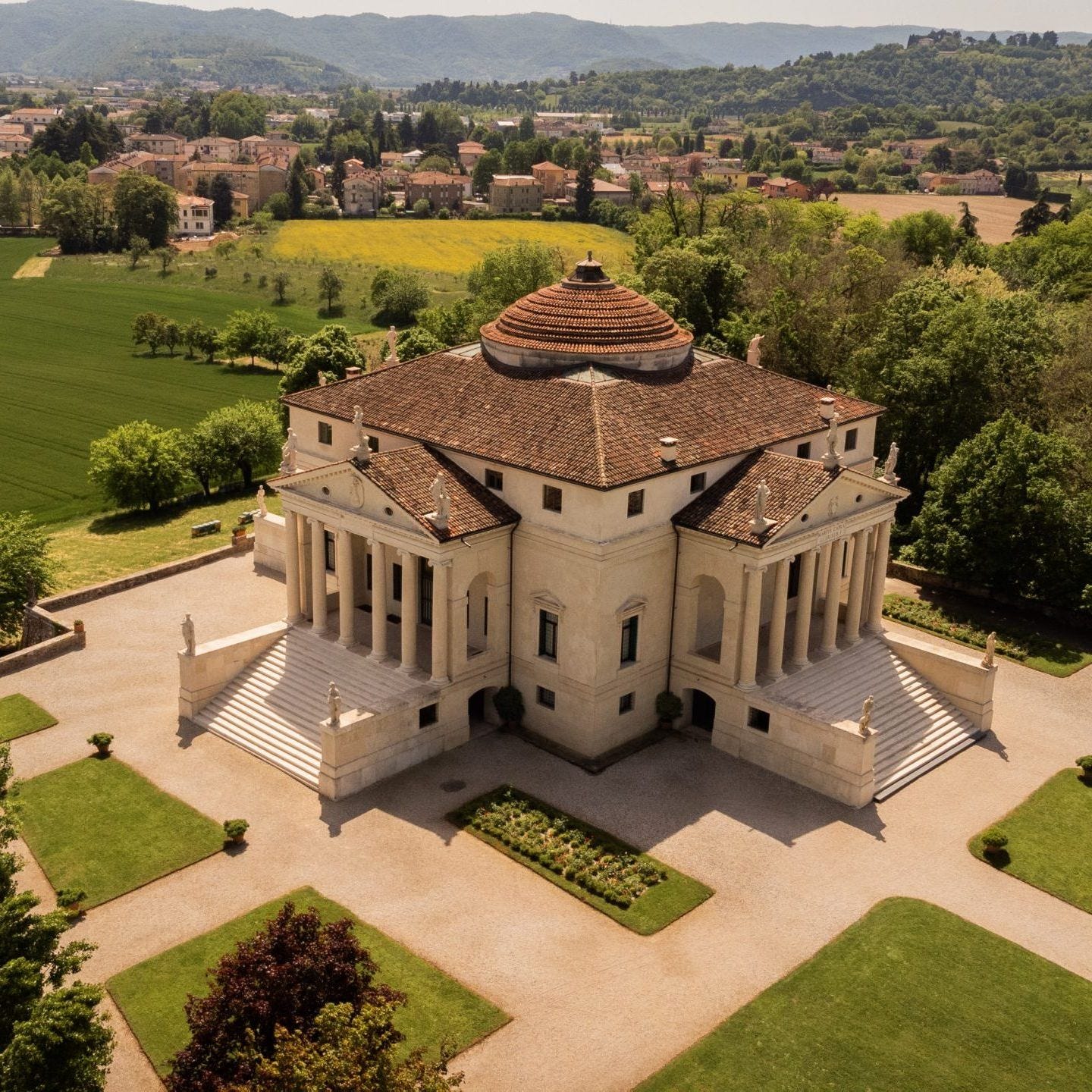
A hand belongs to an arm and an arm belongs to a body; architecture could work in much the same way. The height of a column related to its width while the dimensions of a room related to the building around it.
The design of a temple depends on symmetry, the principles of which must be most carefully observed by the architect. They are due to proportion, in Greek analogia. Proportion is a correspondence among the measures of the members of an entire work, and of the whole to a certain part selected as standard. From this result the principles of symmetry. Without symmetry and proportion there can be no principles in the design of any temple; that is, if there is no precise relation between its members, as in the case of those of a well shaped man. For the human body is so designed by nature that the face, from the chin to the top of the forehead and the lowest roots of the hair, is a tenth part of the whole height; the open hand from the wrist to the tip of the middle finger is just the same; the head from the chin to the crown is an eighth… The other members, too, have their own symmetrical proportions, and it was by employing them that the famous painters and sculptors of antiquity attained to great and endless renown. Similarly, in the members of a temple there ought to be the greatest harmony in the symmetrical relations of the different parts to the general magnitude of the whole.
— Vitruvius, De Architectura, Book III, Chapter I (trans. Morris Hicky Morgan)
Renaissance architects became fascinated by this idea.
When Andrea Palladio designed his villas in sixteenth-century Italy he used carefully related dimensions to organize rooms and façades. A building could be large without feeling clumsy because its individual parts belonged to a larger system.
Beauty will result from the form and correspondence of the whole, with respect to the several parts, of the parts with regard to each other, and of these again to the whole; that the structure may appear an entire and complete body, wherein each member agrees with the other, and all necessary to compose what you intend to form.
— Andrea Palladio, The Four Books of Architecture, Book I, Chapter I (1570; trans. Isaac Ware)
This is one reason old buildings can feel so satisfying even when you know absolutely nothing about architecture.
Your eye encounters relationships it can understand.
A window has a relationship to the wall around it and the wall has a relationship to the entire façade; once those relationships begin working together the building starts feeling like a complete composition.
Which brings us naturally to the second pillar.
2. Symmetry
Stand in front of a Georgian townhouse and you can usually understand the building almost immediately.
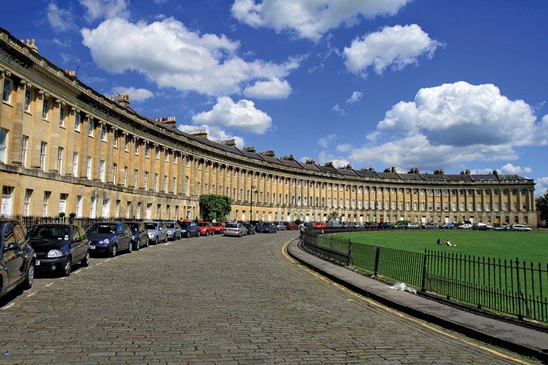
The entrance establishes the center while the windows balance one another across the façade. Your eye does not need instructions because the architecture already tells you how the building is organized.
This is symmetry at its simplest.
Leon Battista Alberti, writing a century before Palladio, treated that balance not as a rigid mirror-image but as a concordance of parts so complete that nothing in it could be altered without loss.
Beauty is a form of sympathy and consonance of the parts within a body, according to definite number, outline, and position, as dictated by concinnitas, the absolute and fundamental rule in Nature. This is the main object of the art of building, and the source of her dignity, charm, authority, and worth… Beauty is that reasoned harmony of all the parts within a body, so that nothing may be added, taken away, or altered, but for the worse.
— Leon Battista Alberti, De re aedificatoria, Book VI, Chapter 2 and Book IX, Chapter 5 (c. 1452; after the translations of James Leoni and Joseph Rykwert)
Of course traditional architecture was never perfectly symmetrical in every situation. Medieval streets are full of irregular buildings; even grand palaces sometimes adjusted themselves around awkward sites.
The important point is that symmetry gave architects a powerful way to create visual order.
Take the classical country house.
Once the central entrance was established the rest of the façade could develop around it; windows and architectural details then reinforced the same underlying structure.
The result feels calm because you understand where everything belongs.
But symmetry alone can also become boring.
That is why beautiful architecture needs hierarchy.
3. Hierarchy
Traditional buildings rarely treat every part of the façade as equally important.
Something comes first.
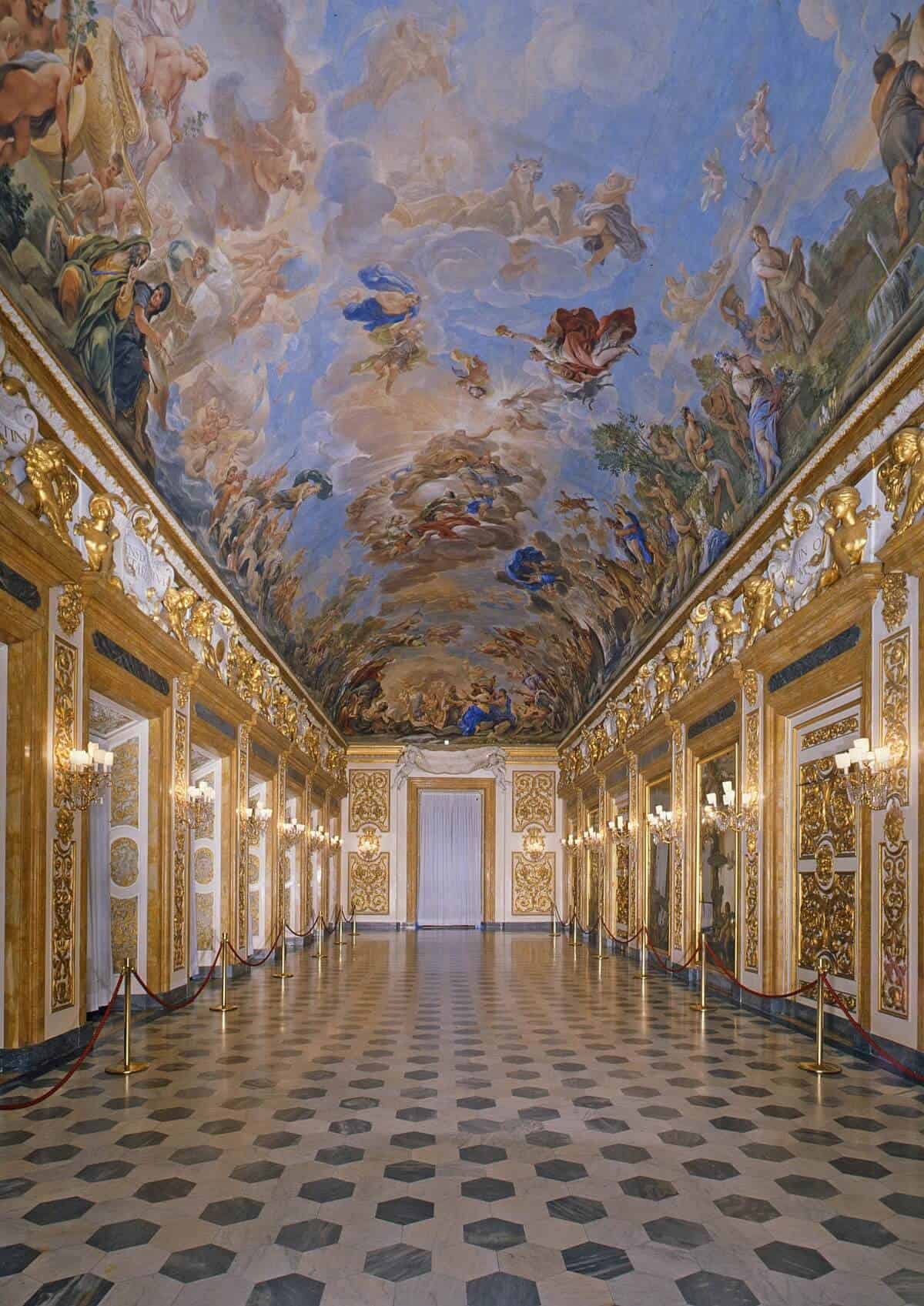
The entrance might receive a larger doorway while the principal floor gets taller windows; the upper floors then become simpler as the building rises.
Palladio put the same idea in practical terms. Convenience, he wrote, depends on rank as well as on placement.
An edifice may be esteemed commodious, when every part or member stands in its due place and fit situation, neither above or below its dignity and use; or when the loggias, halls, chambers, cellars and granaries are conveniently disposed, and in their proper places.
— Andrea Palladio, The Four Books of Architecture, Book I, Chapter I
You can see this beautifully in the palaces of Florence.
The ground floor often appears heavy and strong while the upper levels become more refined; a large cornice then finishes the building at the roofline.
Everything has a place in the composition.
This principle becomes even clearer in churches because the architecture needs to tell you where to go. The main entrance receives special treatment and the altar becomes the destination inside; architecture therefore guides attention through importance.
Modern graphic designers do something similar every day.
A headline is larger than the text underneath because information needs hierarchy; if every word appeared at exactly the same size the page would become difficult to understand.
Buildings work much the same way.
Once hierarchy tells us what matters the next question is how the different parts relate across the façade.
That is where rhythm comes in.
If these essays have changed the way you see the world around you, the paid tier goes further.
You get longer, more researched pieces on the places that shaped Western civilization and the stories behind them. Deep dives into tradition, craftsmanship, and what the built world reveals about culture. Travel guides that teach you to actually read the places you visit.
This project is kept alive by people who care about old-world traditions. For a few dollars a month, you can be one of them.
4. Rhythm
Look at a long traditional building and start counting the windows.
You will usually discover a pattern.
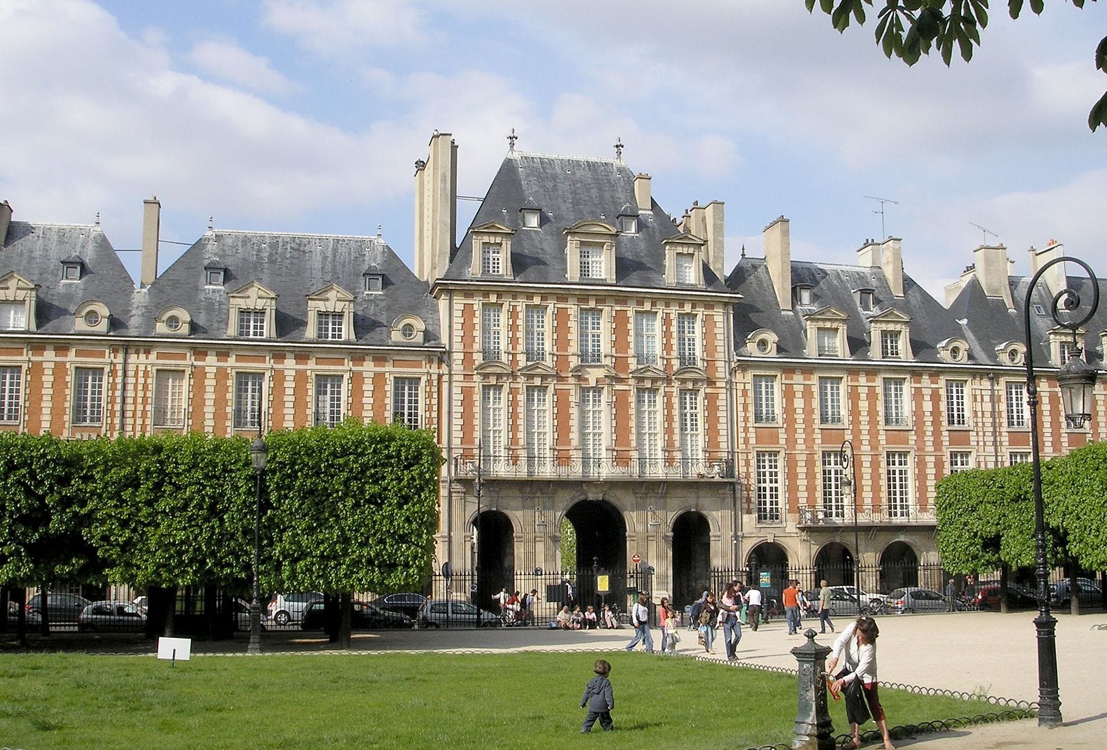
Window follows window while columns or pilasters may divide the façade into repeated sections; the building develops a rhythm that your eye can follow as you walk past it.
The Danish architect Steen Eiler Rasmussen described that pattern as something almost as elementary as counting.
The simplest method, for both the architect and the artisans, is the absolutely regular repetition of the same elements, for example solid, void, solid, void, just as you count one, two, one, two. It is a rhythm everyone can grasp. But it is also possible to use more complicated rhythms… Architecture can be compared with music in that both are based on repetition. The rhythm of a building is experienced as one moves through it or past it; the façade is not a picture to be taken in at a glance, but a sequence unfolding in time.
— Steen Eiler Rasmussen, Experiencing Architecture (1959)
This matters enormously on a street.
A large building without rhythm can become one enormous surface. Break that same façade into repeated bays and suddenly the scale becomes easier to understand; you experience the building piece by piece rather than confronting the entire mass at once.
Classical architecture became exceptionally good at this.
Architects could repeat columns across a façade while varying the central section; repetition created unity and variation prevented monotony.
You can see the same principle in ordinary terraced houses.
One house might be quite simple on its own. Place twenty beside one another with similar windows and proportions; suddenly the entire street becomes a composition.
Which helps explain why beautiful architecture is never only about individual buildings.
It also depends upon how those buildings relate to us.
5. Human Scale
A door tells you something very useful about a building.
It tells you how big a person is.
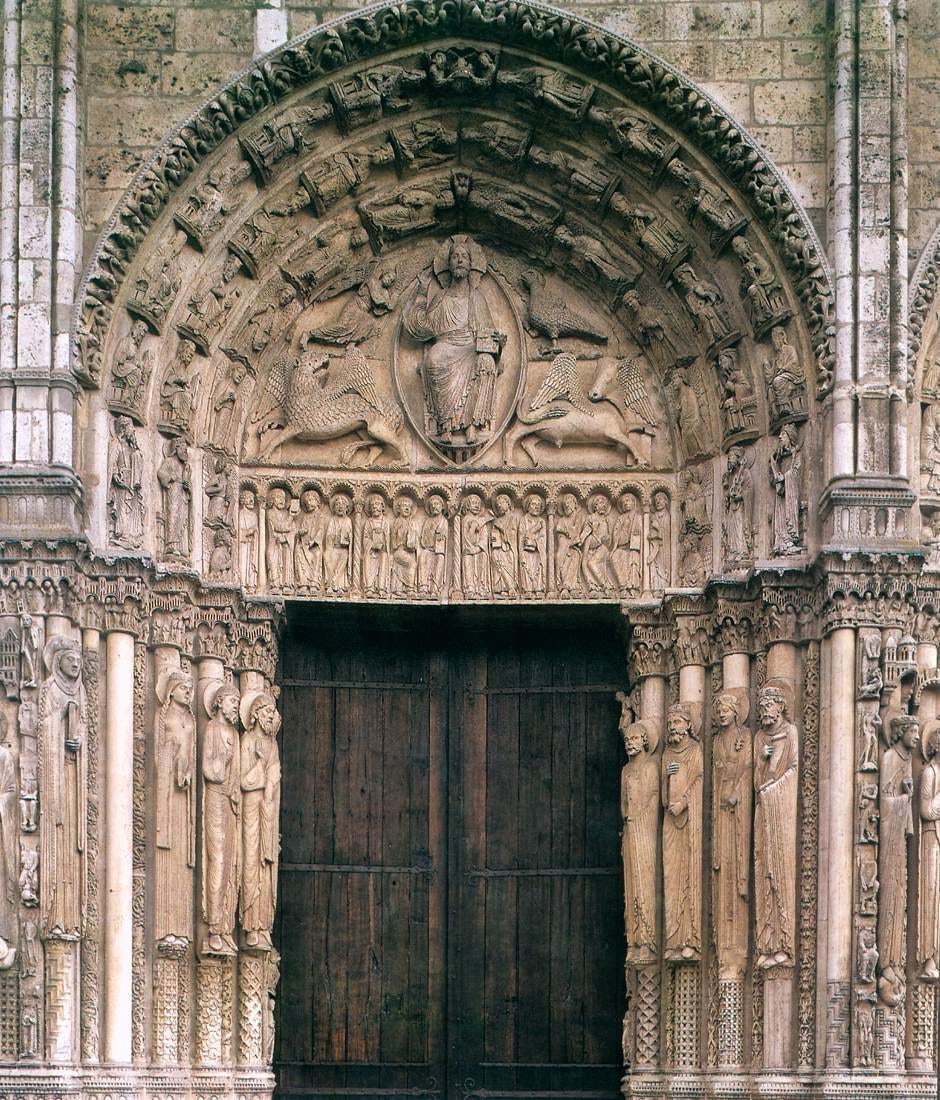
Windows do something similar because their dimensions traditionally relate to rooms occupied by human beings; balconies and steps give us even more clues.
Together these elements allow us to understand the scale of a building almost instinctively.
Le Corbusier tried to turn that instinct into a measuring system. The Modulor was his attempt to keep even large modern buildings answerable to the body.
The Modulor is a measuring tool based on the human body and on mathematics. A man-with-arm-upraised provides, at the determining points of his occupation of space—foot, solar plexus, head, tips of the fingers of the upraised arm—three intervals which give rise to a series of golden sections, called the Fibonacci series… Architecture must be a thing of the body, a thing which the body can measure and against which the body can measure itself. A building that has lost the human scale has lost the means by which we recognize it as a place made for us.
— Le Corbusier, The Modulor (1948/1954)
This becomes especially important with large structures.
A cathedral can rise far above the people standing beneath it while still giving them smaller elements they can understand. The doorway meets the human body at ground level; from there larger architectural elements carry the eye upward.
So monumental architecture does not necessarily mean inhuman architecture.
The two can coexist.
Problems begin when a building loses these intermediate scales. An enormous blank wall gives the eye very little information while a façade broken into windows and entrances tells us how the building relates to the people using it.
Traditional architects understood this particularly well because buildings were experienced at walking speed.
You approached the door and passed the windows; architecture unfolded at the same pace as the human body.
And because you experienced it from close range the materials mattered enormously.
6. Material
Old buildings age.
That sounds obvious but it is one of their most interesting qualities.
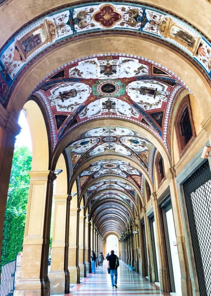
Stone changes as rain passes over it while brick develops variations across its surface; after decades the building can look different without necessarily looking worse.
John Ruskin thought that aging was not a defect of material but part of a building’s glory.
For, indeed, the greatest glory of a building is not in its stones, nor in its gold. Its glory is in its Age, and in that deep sense of voicefulness, of stern watching, of mysterious sympathy, nay, even of approval or condemnation, which we feel in walls that have long been washed by the passing waves of humanity… It is in that golden stain of time, that we are to look for the real light, and colour, and preciousness of architecture; and it is not until a building has assumed this character, till it has been entrusted with the fame, and hallowed by the deeds of men, till its walls have been witnesses of suffering, and its pillars rise out of the shadows of death, that its existence, more lasting as it is than that of the natural objects of the world around it, can be gifted with even so much as these possess, of language and of life.
— John Ruskin, The Seven Lamps of Architecture, “The Lamp of Memory” (1849)
Traditional materials also tell you something about how a building was made.
You can see individual bricks and understand the wall as something assembled by human hands; carved stone can reveal the marks of craftsmanship at a much smaller scale.
This gives the building depth.
A stone façade looks different from twenty metres away than it does from two metres away because new details appear as you approach it. The architecture rewards you for getting closer.
Local materials also helped give cities distinct identities.
Bath became famous for its pale stone while Bologna became associated with warm brick; architecture therefore grew out of the material available around it.
Once the structure and material were in place architects could add the final layer.
And this is probably the one modern architecture has argued about most.
7. Ornament
For most of architectural history nobody found it particularly strange that a useful building might also contain decoration.
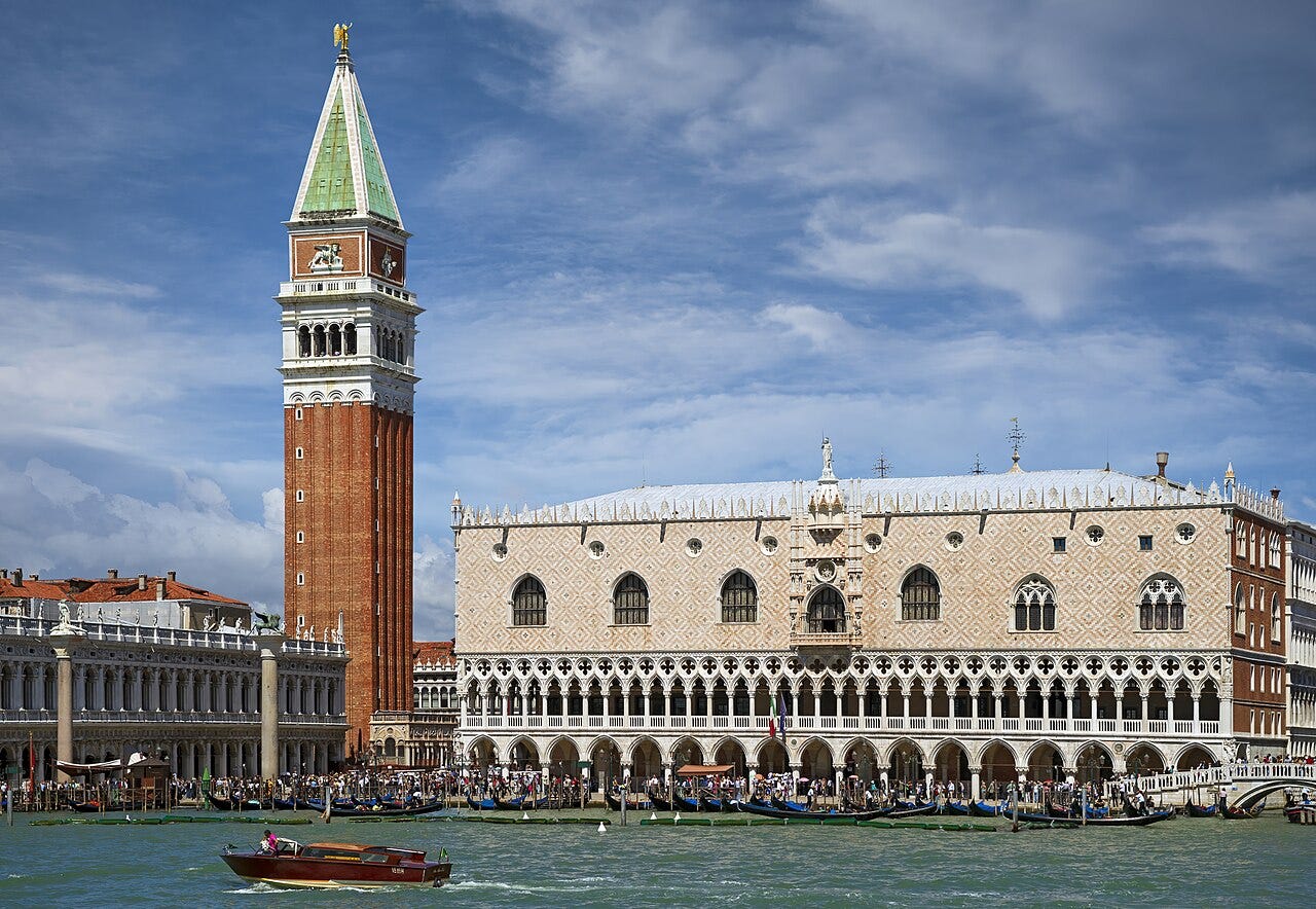
A window could keep out the rain and still receive a beautiful surround; a roof could protect the building while the cornice underneath gave the façade a proper ending.
Ruskin went further, and treated ornament not as an optional finish but as the point at which building becomes art—provided it was put where the eye could rest.
Ornamentation is the principal part of architecture, considered as a subject of fine art… What is the place for ornament? Consider first that the characters of natural objects which the architect can represent are few and abstract… Hence then a general law, of singular importance in the present day, a law of simple common-sense—not to decorate things belonging to purposes of active and occupied life. Wherever you can rest, there decorate; where rest is forbidden, so is beauty. You must not mix ornament with business, any more than you may mix play. Work first, and then rest. Work first, and then gaze; but do not use golden ploughshares, nor bind ledgers in enamel. Put it in the drawing-room, not into the workshop; put it upon domestic furniture, not upon tools of handicraft. Yes, if you do it consistently, and in places where it can be calmly seen; but not if you use the beautiful form only as a mask and covering of the proper conditions and uses of things.
— John Ruskin, The Seven Lamps of Architecture, “The Lamp of Beauty” and “The Lamp of Sacrifice” (1849)
Ornament did not need to cover everything.
In the best traditional buildings it usually emphasized parts that already mattered.
A doorway might receive carving because people entered there while a capital marked the point where a column met what it supported; decoration helped explain the architecture as much as embellish it.
Then the twentieth century changed the conversation.
Modernist architects increasingly questioned historical ornament while Adolf Loos gave the attack its most famous expression in his essay Ornament and Crime. Architecture moved toward simpler surfaces and decoration increasingly came to look unnecessary.
The evolution of culture is synonymous with the removal of ornament from objects of daily use… Ornament is wasted labour power and hence wasted health. It has always been so. Today it also means wasted material, and both mean wasted capital… The modern man who tattoos himself is a criminal or a degenerate… I have therefore evolved the following maxim, and pronounce it to the world: the evolution of culture marches with the elimination of ornament from useful objects.
— Adolf Loos, Ornament and Crime (1908)
Yet people never stopped enjoying ornament.
We still travel enormous distances to look at carved churches and decorated houses; when those buildings need restoration we spend extraordinary amounts of money preserving the details previous generations considered worth making.
Perhaps that tells us something.
Beautiful Buildings Are Doing Several Things at Once
None of these seven pillars can create beauty by itself.
Perfect symmetry can become lifeless and ornament can become ridiculous when it overwhelms everything underneath; even beautiful materials cannot rescue a building whose proportions feel wrong.
The interesting part comes when these principles begin working together.
Proportion gives the building order and symmetry makes that order legible; hierarchy tells us where to look while rhythm carries our eyes across the façade.
Human scale connects the architecture to our bodies and material gives it physical character; ornament then adds another layer of meaning and beauty.
Traditional architecture developed these ideas over centuries because architects could see what previous generations built and improve upon it.
That inheritance produced Gothic cathedrals and Georgian streets; it also produced countless ordinary houses that nobody thought important enough to put in an architectural history book.
And perhaps that is the real lesson.
Beautiful architecture does not require every building to become a masterpiece.
It requires us to remember the basic principles that made beautiful buildings possible in the first place.
If these essays have changed the way you see the world around you, the paid tier goes further.
You get longer, more researched pieces on the places that shaped Western civilization and the stories behind them. Deep dives into tradition, craftsmanship, and what the built world reveals about culture. Travel guides that teach you to actually read the places you visit.
This project is kept alive by people who care about old-world traditions. For a few dollars a month, you can be one of them.